National Park Service
UX Associate | 3 Week Turnaround | 3-Person Team
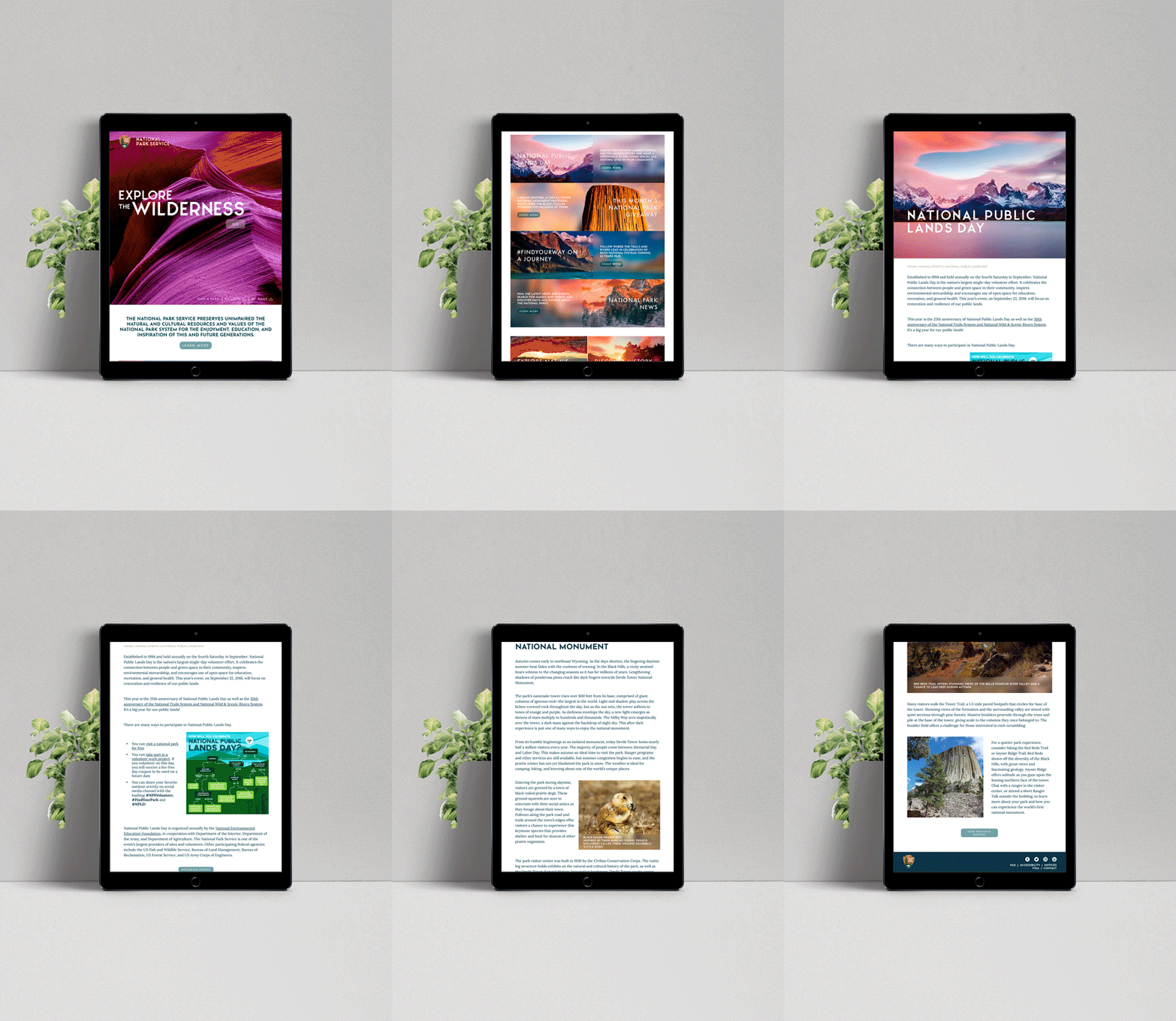
This project proposed the challenge of redesigning a government agency to be responsive while catering to both the needs of its users and the agency in a clearer manner. Deliverables for this included navigation with three webpages for mobile, tablet and desktop that passed accessibility testing and design needed to be clearly directed by research.
The Process
After choosing the National Park Service to focus on, our goal was to understand and more clearly define what the NPS was actually about. We took a lot of time to develop a concise mission statement and ensure that every aspect of the redesign was directly connected to that, while also making sure to clarify the site navigation since we found many rabbit holes for the users to get lost in, while ensuring pages with voluminous copy are visually interesting.
At the end of the day, national parks are for everybody from every walk of life, so the site needed to be accessible and clear to everyone, regardless of what device they’re on, cohesive and understandable, and serve a clear purpose.
-
Site audit included redlining, site map & user flow, and SWOT analysis off the start, but we quickly found just how difficult it was to perform any task, let alone figure out what the intent with the website was. It seemed to be an information dump, an extremely informative website, but too easy to get lost.
After looking through this, we developed a usability test plan, which made us realize developing a clear mission statement was the most important step to inform our redesign.
-
The National Park Service preserves unimpaired the natural and cultural resources and values of the National Park System for the enjoyment, education, and inspiration of this and future generations. The Park Service cooperates with partners to extend the benefits of natural and cultural resource conservation and outdoor recreation throughout this country and the world.
-
We focused on the navigation of the entire site to be much more streamlined to give users a clearer experience, which led to multiple iterations of both the homepage and nav menu. Specifically with the menu, this was the biggest pain point in terms of preventing users from navigating through the site to get where they were actually looking to go instead of falling down rabbit holes.
We wanted users to experience a flow that made sense, while highlighting the volume of information available.
-
A streamlined site with clear navigation and a visual focus using the natural beauty within the national parks


